2020 — 2022 • iOS, Android & Web
Gousto was scaling fast, but its design system was almost non-existent. I led the team which build and launched Goustos first scalable design system, creating consistency, improving efficiency, and ensuring accessibility. Working closely with engineers, we transformed how design and development collaborated and improved the baseline of design excellence within Gousto.

Intro
When I joined Gousto in April 2020, it became clear almost immediately that the product workflow wasn’t working as efficiently as it could. The team was pushing out experiments at speed, often without reflecting on past iterations. This wasn’t due to a lack of care, but because the company had scaled so rapidly during COVID-19 that design consistency had been overlooked.
Most of the product designers at the time came from heavy UX backgrounds, and UI craftsmanship had never been prioritised. During the hiring process, Gousto made it clear that I would be filling this gap, so I was keen to show how a structured, scalable UI system could improve not just design quality but efficiency for everyone.
It’s worth mentioning that this wasn’t actually part of my role. It was a clear gap in the design and development process that needed attention, but something I took on alongside my day-to-day squad work.
The Problem: No design system
As I started working on projects, I noticed that design files were chaotic to say the least. It was more like a series of screenshots with experiments retrofitted inside than structured, reusable components. It felt like trying to build Ikea furniture without a manual.
At the same time, Gousto was scaling rapidly due to the pandemic adding team members and tribes with new focus’ left right and center. It was clear that the best way to maintain consistency across an expanding team and a growing product—was to introduce a proper design system and integrate it across teams. This wasn’t my, role by the way, I managed to rally a team together of proactive engineers who were willing to help me on the side of our day-to-day squad work for everyones benefit.

Where we started
Gousto had recently undergone a brand refresh, but in the digital product, this was barely exposed. The only real updates were a new logo and a colour swap. They had also invested in a new font, Axiforma, but were still using Avenir across all platforms—a costly oversight paying for two font licences at the same time.
The existing design system was almost non-existent. It consisted of:
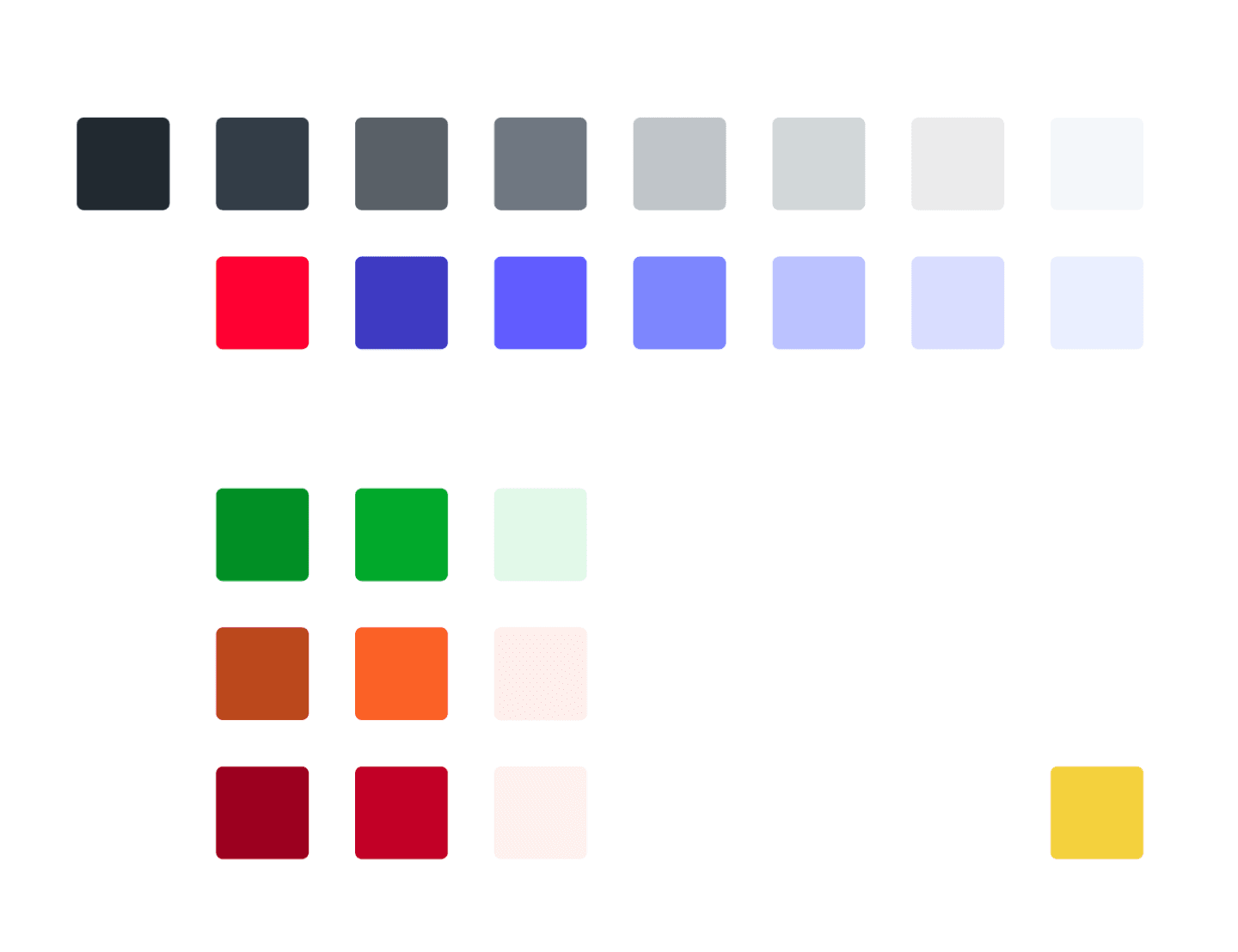
A limited colour palette of 9 hues
A handful of buttons and states
An unstructured and unconsidered font scale
Even worse, these styles weren’t consistently applied anywhere. As I mentioned, before I joined, the team were mainly working with screen shots of the apps current state.
Making a business case for a design system
I strongly believe that design systems are just as important as the brand expression itself. They do more than just improve consistency—they strengthen the user experience, streamline workflows, and enhance the overall perception of quality for the business. But to get buy-in though, I had to sell the benefits to the wider business.
A strong design system would clearly:
Increase consistency across all UI and brand touch points
Enable scalability for rapid company growth
Speed up design and development by reducing the need for unnecessary check-ins
Improve accessibility, ensuring compliance with WCAG 2.1 AA standards
Enhance performance, reducing load times and improving responsiveness
Future-proof the product, making it easier to adapt to brand and UX/UI updates
Laying the foundations
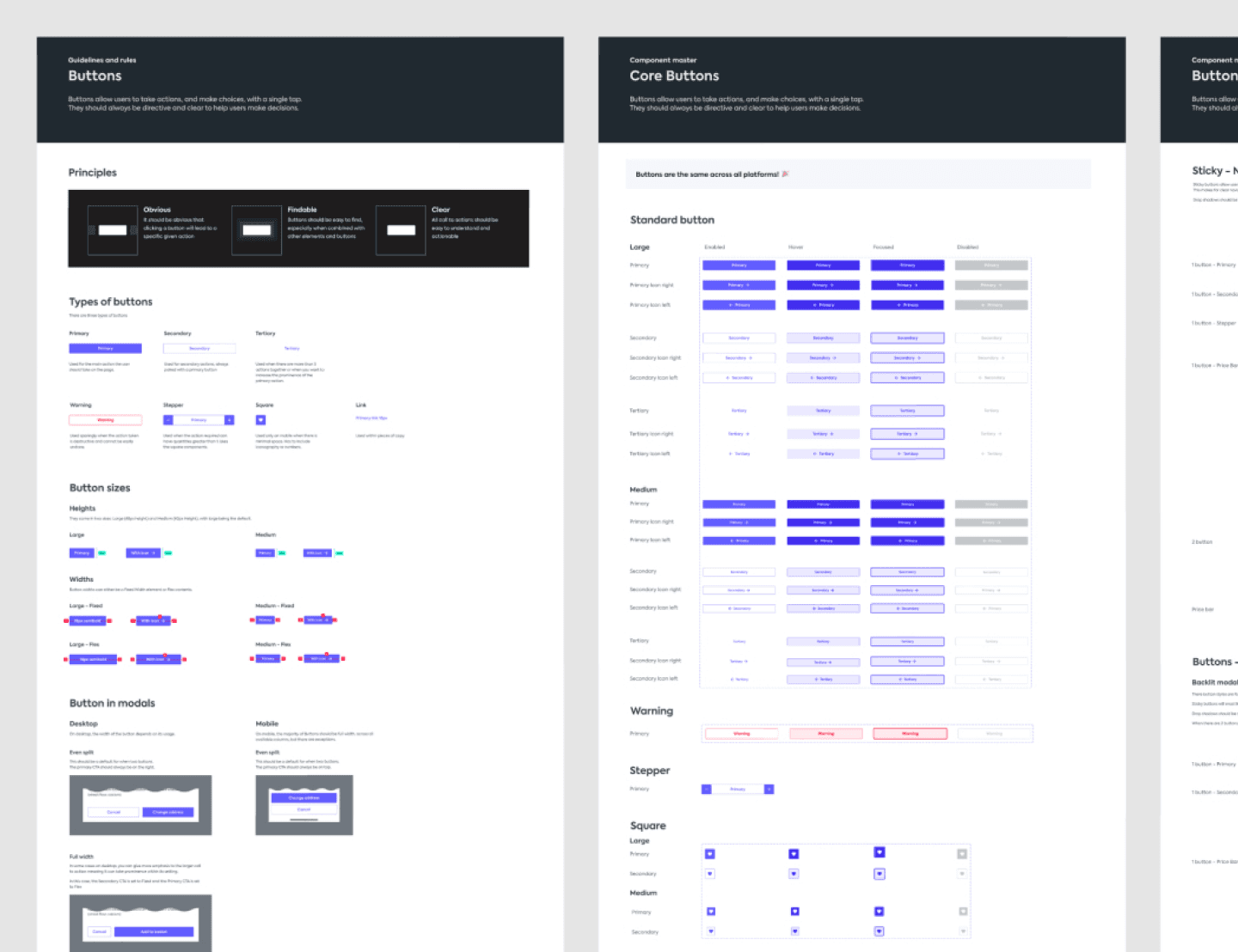
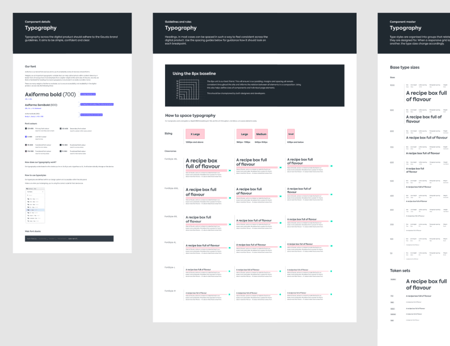
To prove its value, I started by building out the core foundational components: grids, typography, and button styles—demonstrating how strong hierarchy alone could improve even the simplest pages.
With momentum building, we ran a three-day design sprint with the entire product team at the time. The goal was to:
Educate everyone on the importance of design systems
Review best-in-class examples to benchmark against
Define how strict or flexible we wanted the system to be based on existing use cases
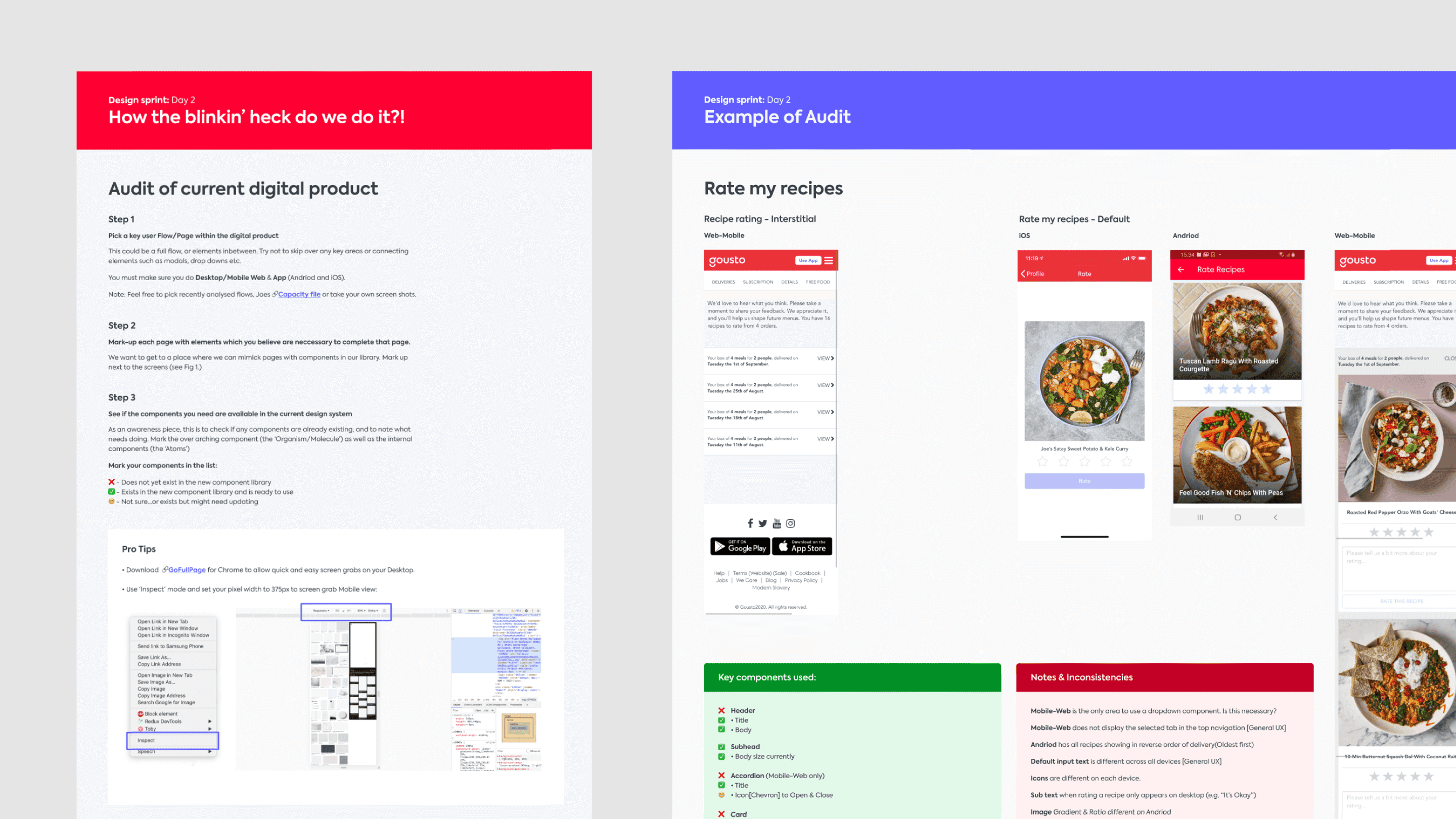
Audit every page of the existing website and app to assess(and really to show the scale of) inconsistencies
Improve our understanding of native platform experiences
The audit was eye-opening to say the least. Pairing up for the review helped expose just how fragmented the design was, motivating the team to get involved and fix it.


What we built in my time there
A design system isn’t just for designers. It needs developers and PM’s input and collaboration, especially seeing as this was seen as a ‘side project’ internally. I discovered that a small, dormant design guild had existed at Gousto, so we resurrected and relaunched it.
We built a new small team, bringing in front-end engineers across different squads and platforms who were passionate about UI quality and consistency. Gousto’s engineering team already had Tech 10%—a fortnightly slot for developers to work on non-roadmap projects—so we pitched a dedicated slot for product design to do the same. It was approved, giving us time to work directly with developers and drive system adoption.
We used these fortnightly design guild meetings to:
Review new components before development
Refine our workflow and design processes
Ensure alignment between teams
We also introduced Tech 10% workshops, which I used to work on the system with different designers and engineers, gradually turning our vision into a reality.
Over a year, we chipped away at design debt, improving both product quality and ways of working. The result was a fully scalable design system that impacted every part of the digital product.
Key Outcomes & Impact
A new Figma design system, with:
350+ components with specific rules
Variability for platform-specific differences
Dark mode support for iOS and Android
AA-compliant colour system, meeting WCAG 2.0 standards
A revitalised Design Systems Guild, including:
30 engineers across platforms
Fortnightly meetups to discuss needs and improvements
A Slack channel for ongoing discussions, inspiration, and feedback
Dedicated ‘Fresh Eyes’ Slack channel for open critique from the entire product and engineering team
And, a new way of working:
A structured component review process, ensuring quality before development
A web component library with clear workflows, making it easier for engineers to know when to build new components
A component progress tracker, integrated with Jira, to ensure visibility across design and engineering
Like any good design system, it’s never truly done. The best systems evolve with the product, adapting to new paradigms, UX trends, and business needs. That’s what makes working in tech so exciting… you’re constantly moving with it.