2022—2023 • Web
National Grid's billing platform was clunky and confusing, forcing customers to constantly call support. I helped redesign the self-service experience, improving accessibility, streamlining payments, and increasing digital adoption—reducing operational costs while rebuilding trust.


Intro
National Grid serves 20 million customers across the Northeast of the United States, specifically in Boston, Massachusetts, and New York. As the region's sole energy provider, their focus historically hadn't been on customer experience, until now.
With one in five Americans unable to afford their energy bills last year and over four million people disconnected, the stakes were high.
Energy itself is notoriously complex. KWh, joules, therms, payment plans, fixed vs. variable rates… there’s a lot to wrap your head around. And with rising costs, trust in utility services is dwindling faster than ever, with some even believing the complexity is an intentional move to over charge. With rising costs and a sharp decline in trust, it was clear that National Grid needed to uplift their customer experience and take meaningful action.
Project objectives
National Grid’s goal was to reduce operational costs by increasing self-service adoption, starting with the web platform.
The existing self-serve experience was outdated, inconsistent, and difficult to use, leading customers to call support. Alongside this, a critical code replatforming was underway to improve system stability, reduce errors, reduce down time, and cut overall cost by decreasing reliance on Salesforce.
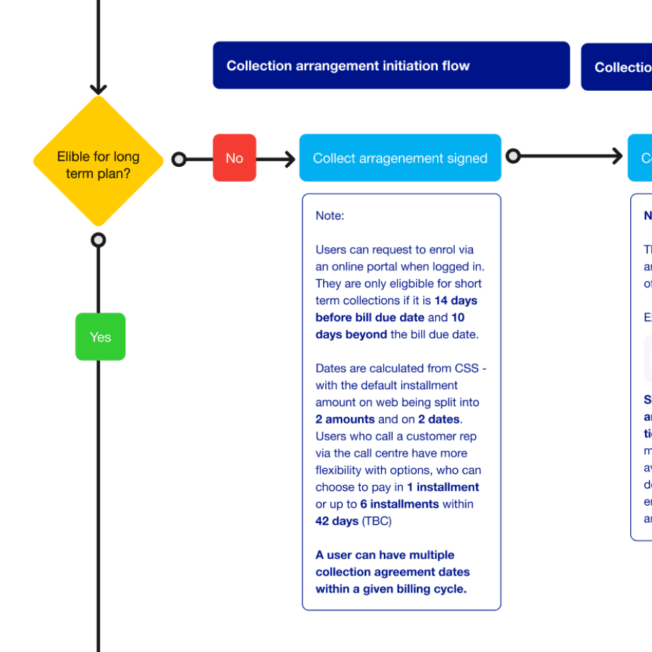
Alongside design and development, we also navigated complex business logic, shaped by varying state laws that influenced everything from billing logic to eligibility for specific plans.
What I worked on & My impact
I joined this project early on as one of two product designers, working alongside a design principle, a handful of developers, and a variety of key stakeholders within National Grid. We started with the core billing journeys, then expanded into more complex areas such as energy calculations, payment plans, moves/transfers, and account management.
With limited digital branding (mostly print-focused) and a tight timeline, we had to move fast. We worked together on the refresh of National Grid’s self-service experience, focusing on:
Empathetic UX copy for better clarity and trust
Clearer visual hierarchy across all breakpoints
Repositioning and simplifying enrollments
Streamlining complex user flows
Expanding National Grid’s digital visual communication
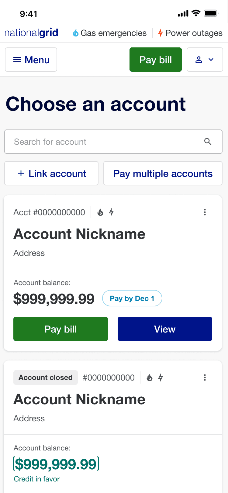


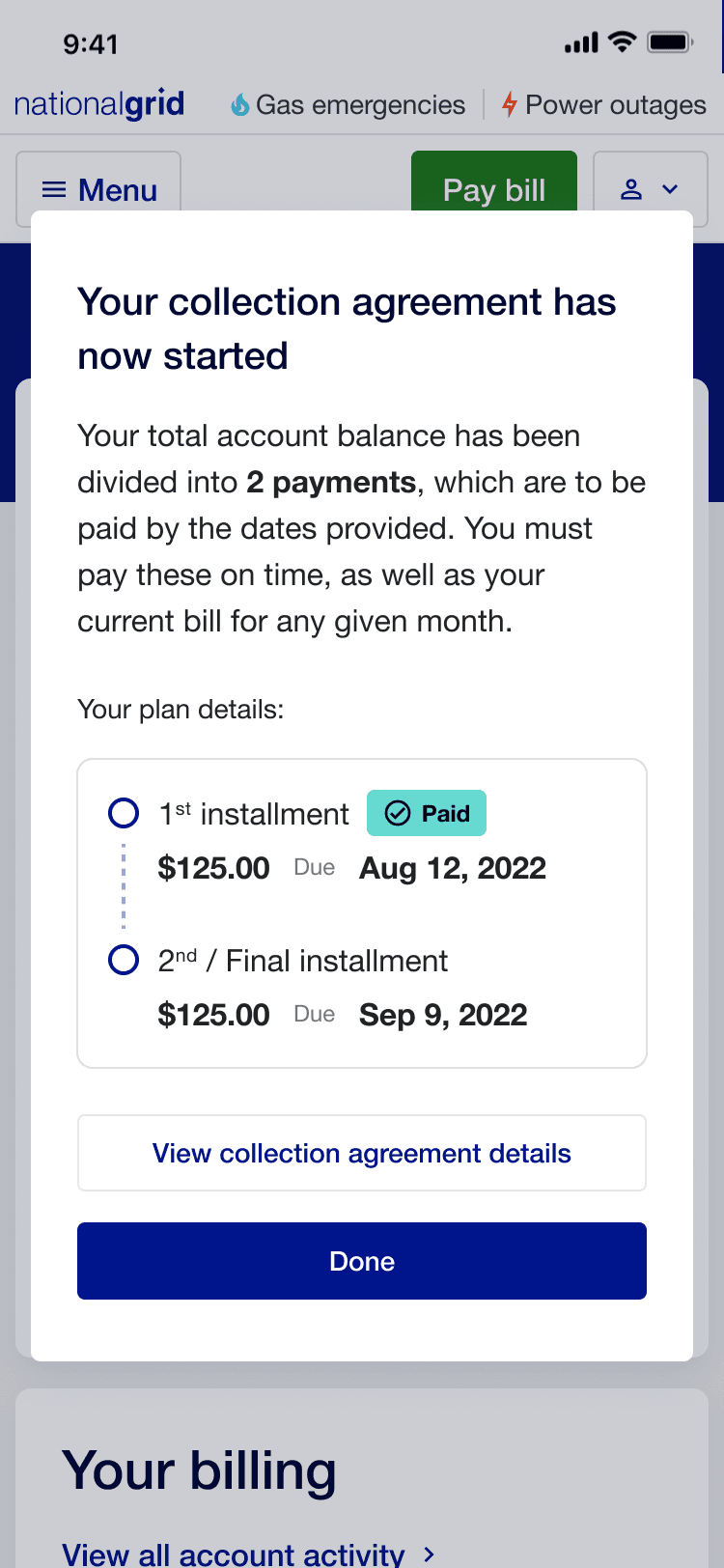
Zooming in on the Dashboard
The dashboard was the most critical part of the self-service experience—every digital customer would interact with it. When I joined the team, the dashboard designs were in build, and they were functional, but uninspiring. Me and the other designers quickly pushed for a more engaging and branded experience. This was a tough sell to the business, as they had already grown attached to the initial design and wanted to move quick, but we all knew this was the moment where we needed to raise the bar.
It needed to support a wide range of user states, including:
Key Account & Payment States
Account types: Standard, Cash
Payment statuses: Scheduled, Pending, Paid, Failed
Enrollment statuses: Payment plans, Balanced billing, Auto-pay
System states: Empty state, Error messages
Account status: Bill issued, Bill paid, Overdue, Credit in favor, Closed, Inactive, Disconnection statuses
To handle this complexity, we introduced a zonal layout, dividing the dashboard into three clear, scannable sections:
Payments (account balance, due date, payment statuses, autopay)
Billing (current bill amount, pay-by date, monthly change, billing enrollments)
Usage Insights (high-level breakdown of energy consumption)
This structure had three major benefits:
Customer Value: Users could quickly find key information
Accessibility Value: Improved content grouping and hierarchy for WCAG 2.0 compliance
Scaling Value: A modular system allowed easy customisation and A/B testing
To mitigate risk and ease stakeholder concerns, we ran A/B tests on the new direction before committing to refactoring development work. The results spoke for themselves:
87% of users preferred the new design, stating it better represented the National Grid brand.
96% found it "very easy to understand", using words like clean, modern, informative, and trustworthy to describe it.
Direct user feedback included:
“I really like Design A. It stands out and makes it easier to pay and manage my account.”
“Everything is much clearer with this version.”
“The new screen with colors looks much better—clean and modern.”
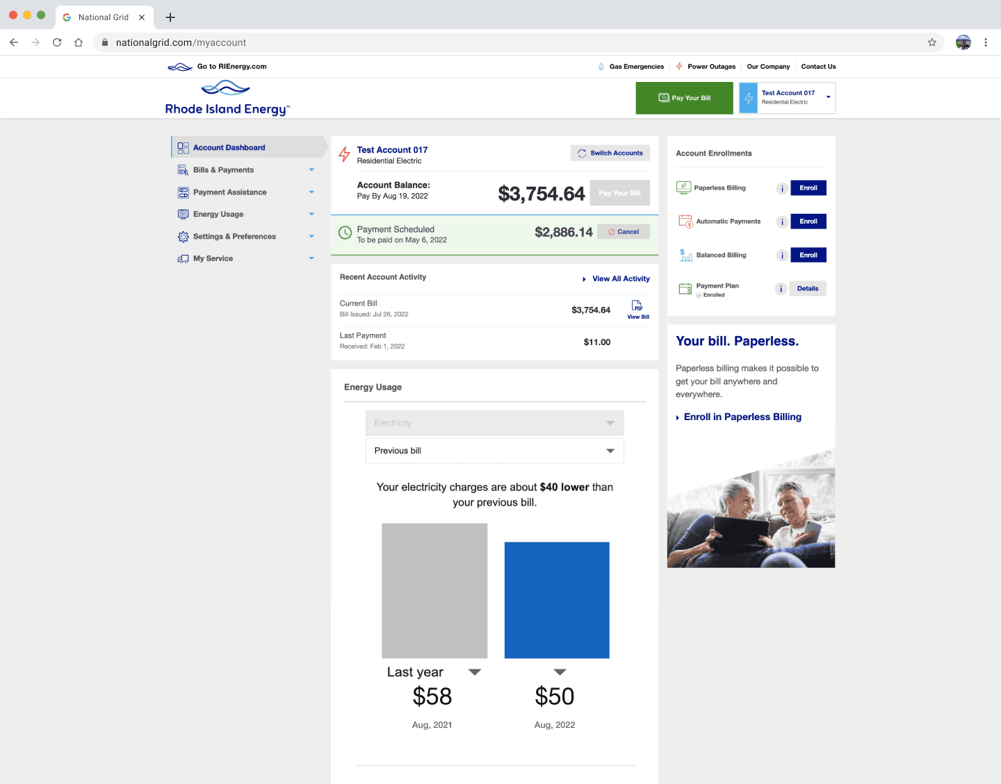
dashboard v0: original experience
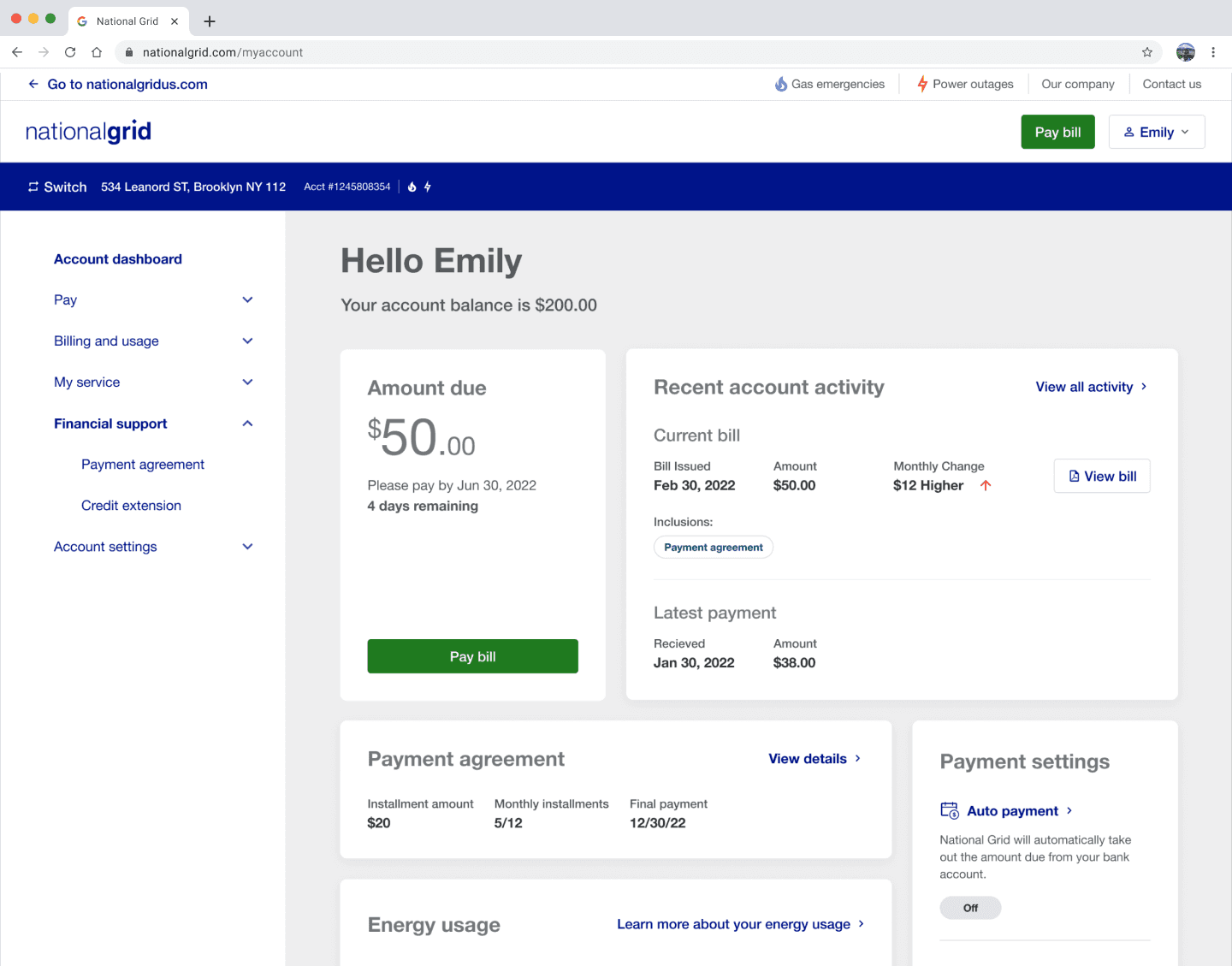
Dashboard V1: Early iterations
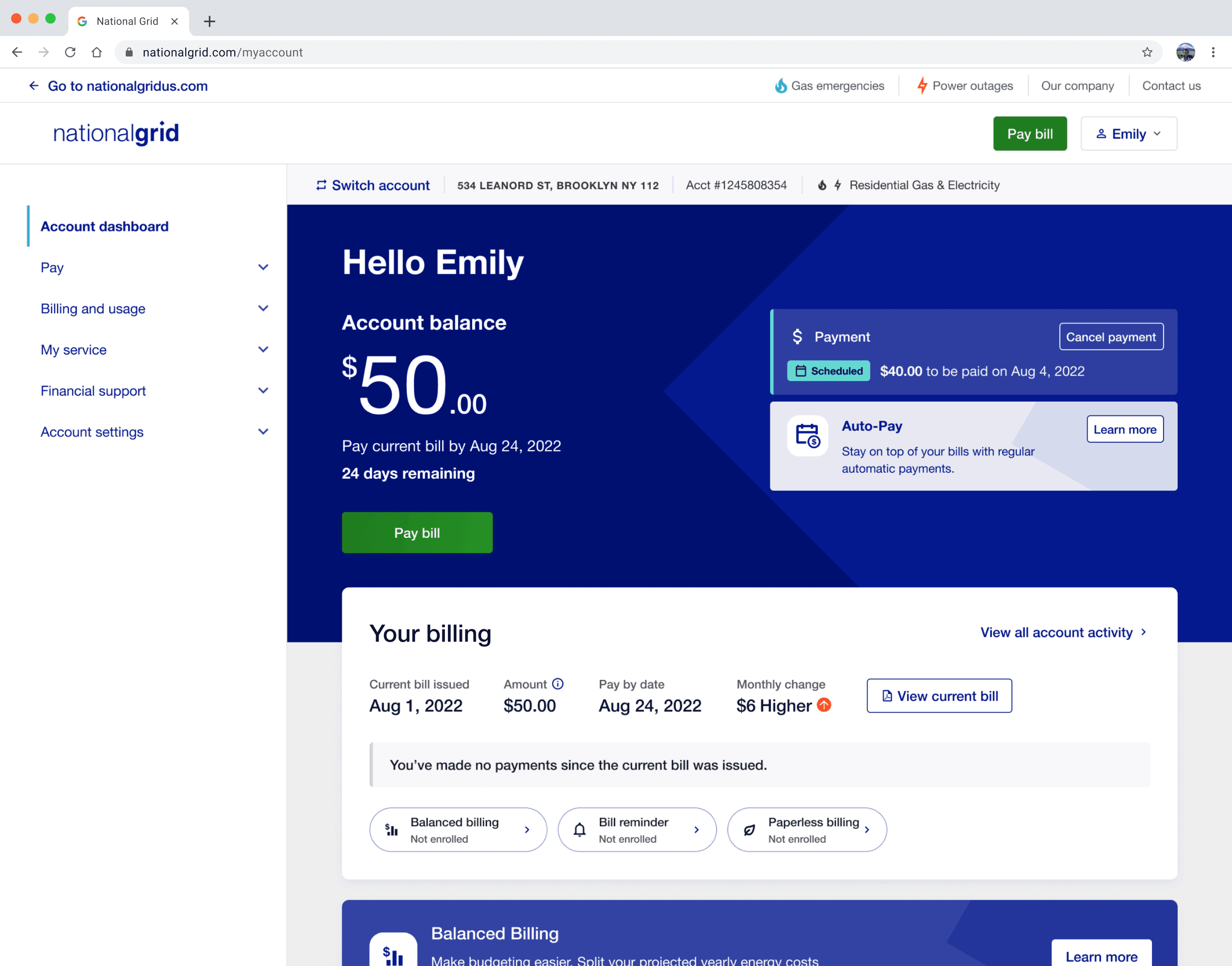
Dashboard V2 — What we released with
Utilising customer research to drive change
Customer research was central to this project. We needed to prove to National Grid who their customers were, what was affecting them, and where they were struggling(both with the service and beyond). This research was not just for design evaluation, but a tool we used to drive internal decisions at pace and inspire teams across the company. It is an old company, with lots of politics, but they were kind and incredibly motivated by the user. The time for change was now, and they were itching for it.
Throughout the project, we conducted research with over 410 users, alongside analysing:
Call center data
App insights
Google Analytics
JD Power ratings & market analysis
This research directly shaped the final product, ensuring we delivered a clear, modern, and trustworthy experience for millions of National Grid 20million+ customers.
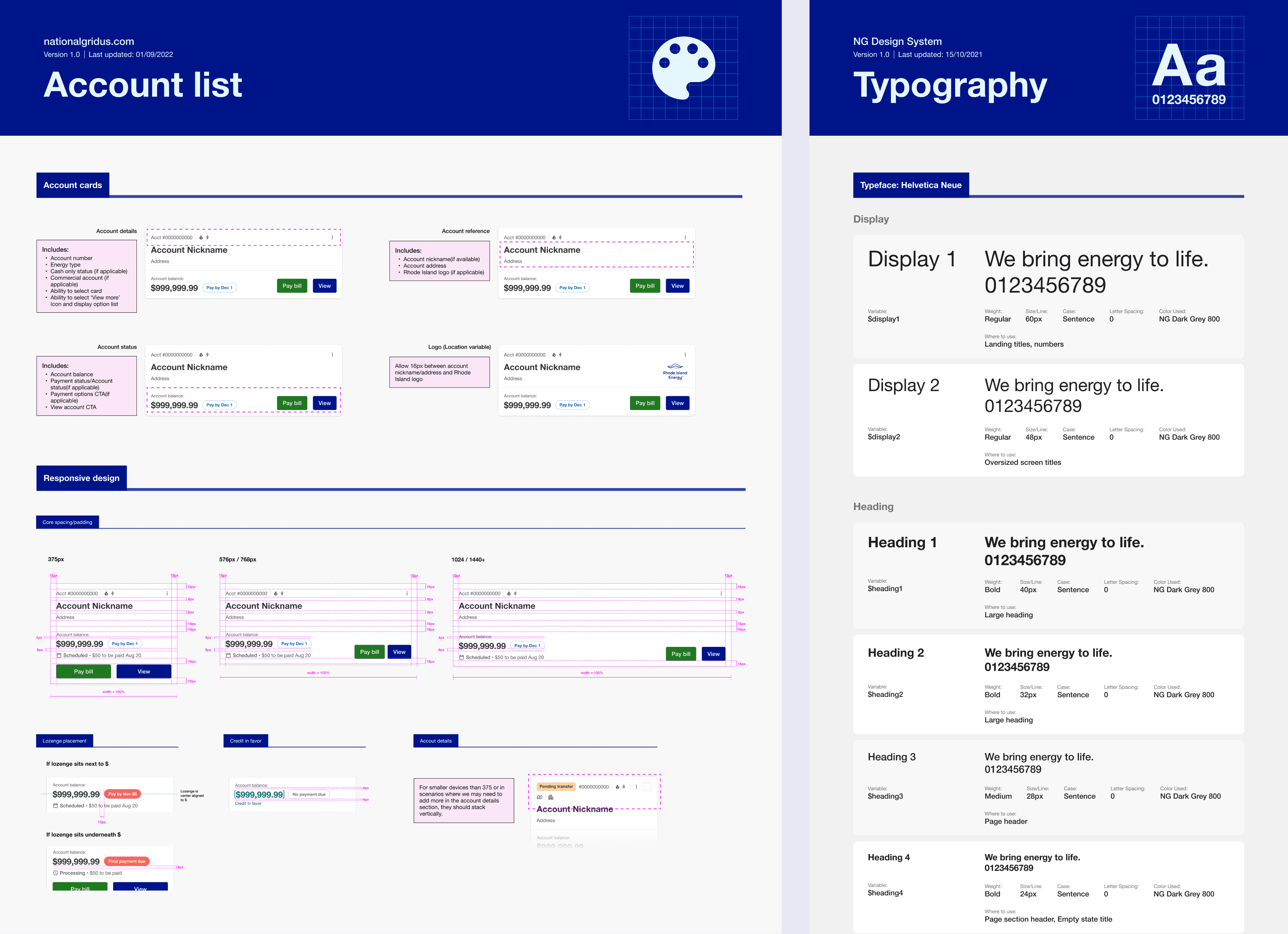
Scaling National Grid’s design system
I also led the design system and style library work, ensuring National Grid could scale designs across locations and customer scenarios. Their old system was bloated and inconsistent with what was in build. Not only that, but they were still working from old Sketch files. We help properly migrated them to Figma, streamlining their end-to-end processes.
We quickly realised that accessibility needed to be a top priority for them. As an energy provider, all users, regardless of ability, had to be able to pay their bills. Every decision, breakpoint, and component was rigorously tested to meet AAA compliance under WCAG 2.0. We focused on:
Navigation & structure for better readability
Hierarchy, structure & contrast for clarity
State management & Aria tagging to support screen readers
Building notoriously difficult components to make accessible, such as data graphs(for energy usage) and date pickers.
much more.
None of this would have been possible without a motivated team across the board. From research all the way to testing. A real team effort.

Snippet of the design system: State management
Collaborating across the business
We embedded ourselves into National Grid’s world, building strong stakeholder relationships. This helped us keep momentum, gather and explain incredibly important business requirements, and visualise complex internal systems for better alignment.
Whilst working on the Dashboard experience, I specifically led the work on Payment plans, User account and Service status’. There was a lot of uncovering undocumented processes and mapping out every scenario customers might encounter.
This was a mammoth project, which I worked on it for 1.5 years, and it continued into late 2024, covering every part of National Grid’s digital services, from integrating new technologies to redefining how customers interact with their energy provider.
This project wasn’t just about fixing an outdated billing system—it was about changing how National Grid engaged with its customers. Through deep research, accessibility, and bold design improvements, we created an experience that was not only functional but truly empowering.


Key outcomes & Impact
$2 billion worth of successful transactions since launch
1.5m+ customers actively using the new migrated service on a monthly basis
Improved data tracking by over 4000% (basically non existent in original service)
100% flows delivered are accessible (to A or AA standard) + Design system